
MORII TEA
//
MORII TEA //
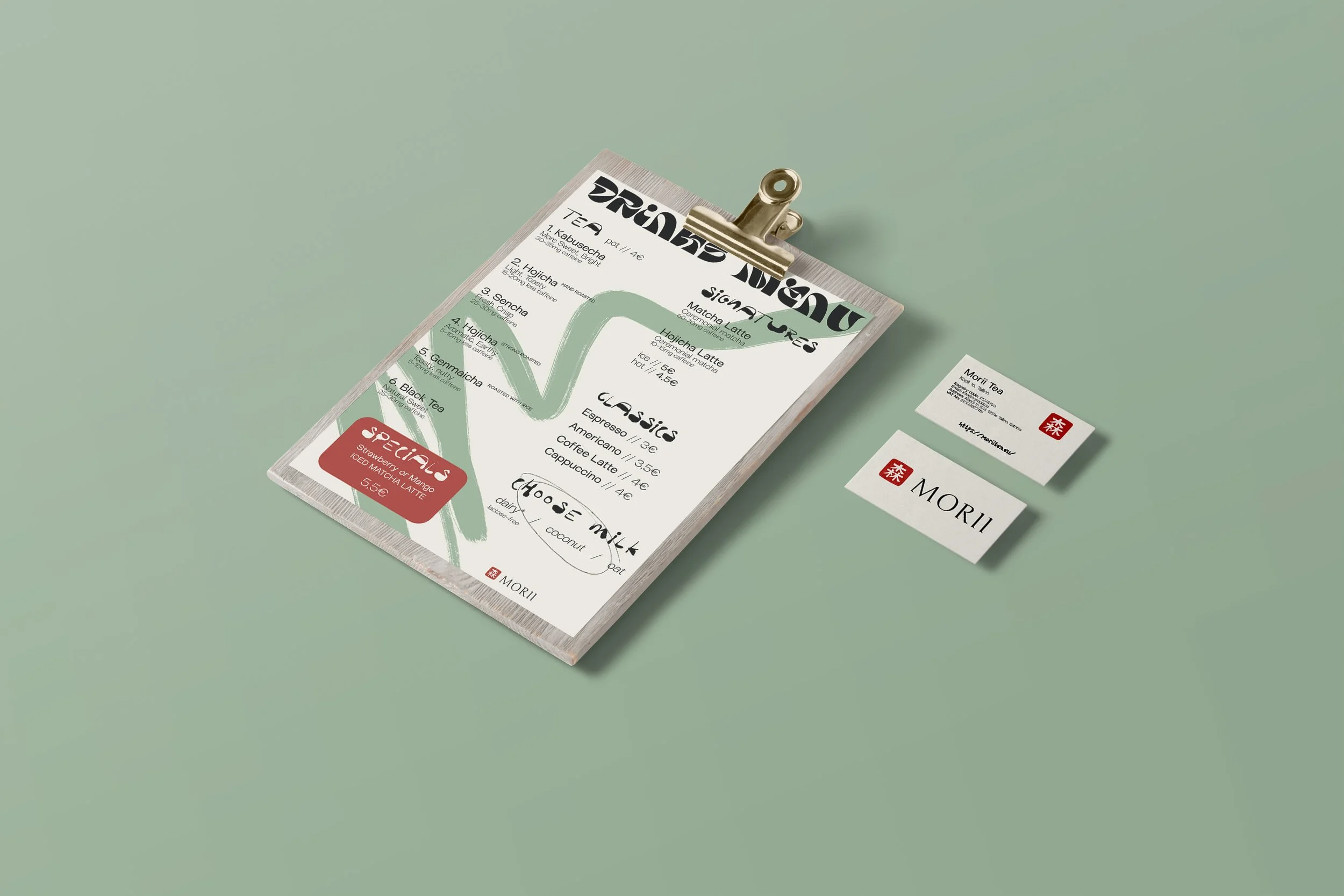
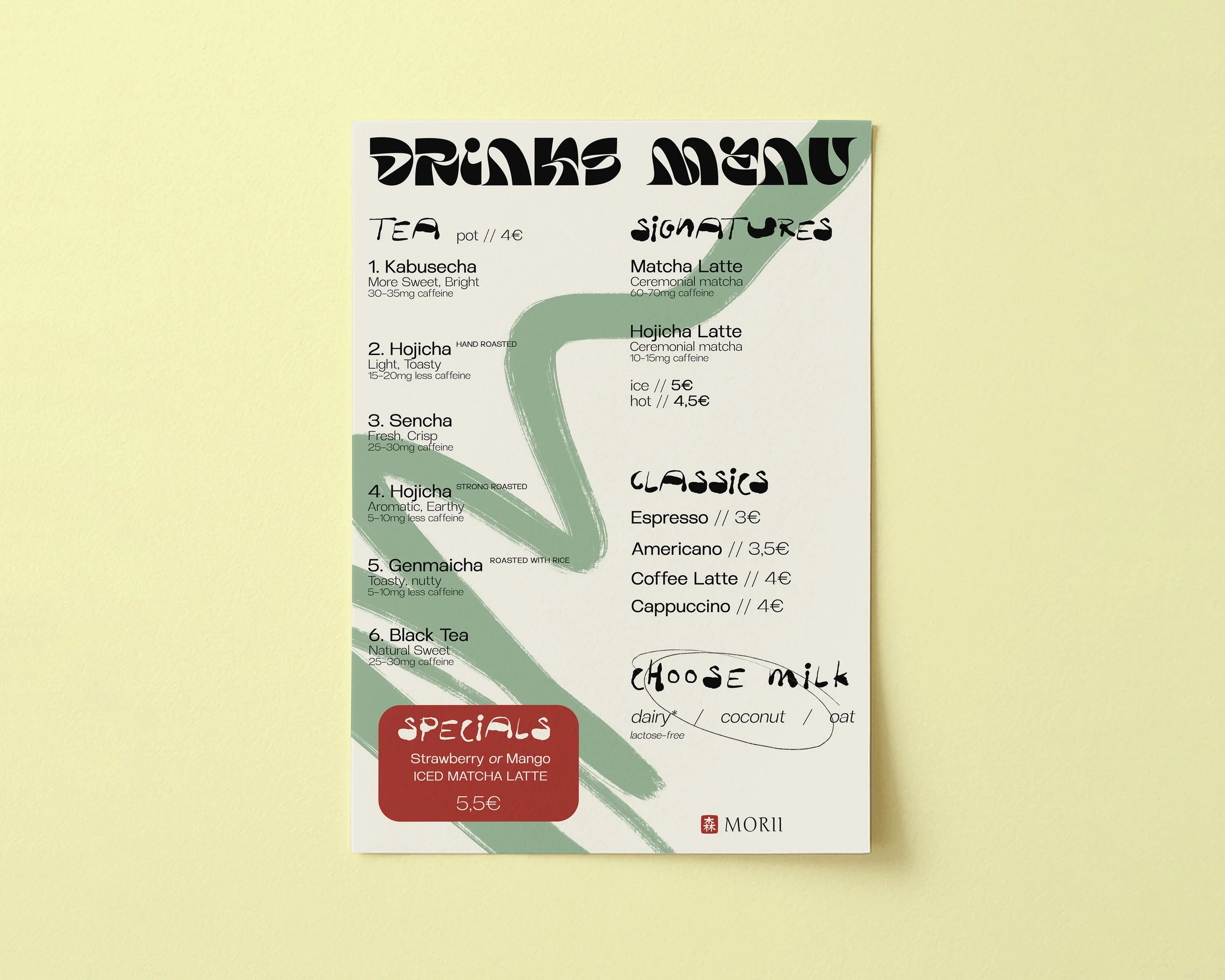
I was given complete creative freedom to design a drinks menu for Morii Tea, a tea house based in Tallinn, Estonia, specialising in ceremonial matcha and premium Japanese teas.
The objective of the project was to create a large-format A1 menu that clearly presents the drinks available in the shop while reflecting the brand’s minimalist and refined identity. The design needed to balance functionality and aesthetics, allowing customers to easily navigate the menu while creating a visual experience that complements the atmosphere of the tea house.
Colour pallete
I developed a colour palette inspired by the brand’s existing visual identity and the natural tones associated with Japanese tea culture. The palette is built around various shades of green, reflecting the different hues of matcha and tea leaves, while creating a calm and organic atmosphere.
An accent shade of red, taken directly from the Morii Tea logo, was introduced to provide contrast and visual emphasis throughout the design. This colour helps highlight key information and creates a stronger connection between the menu and the brand identity.
The selected colour palette consists of:
Deep Forest Green — #212D23
Moss Green — #425B3D
Sage Green — #809C73
Soft Matcha Green — #C9D7B4
Warm Cream — #F3F1E5
Accent Red — #AF4839
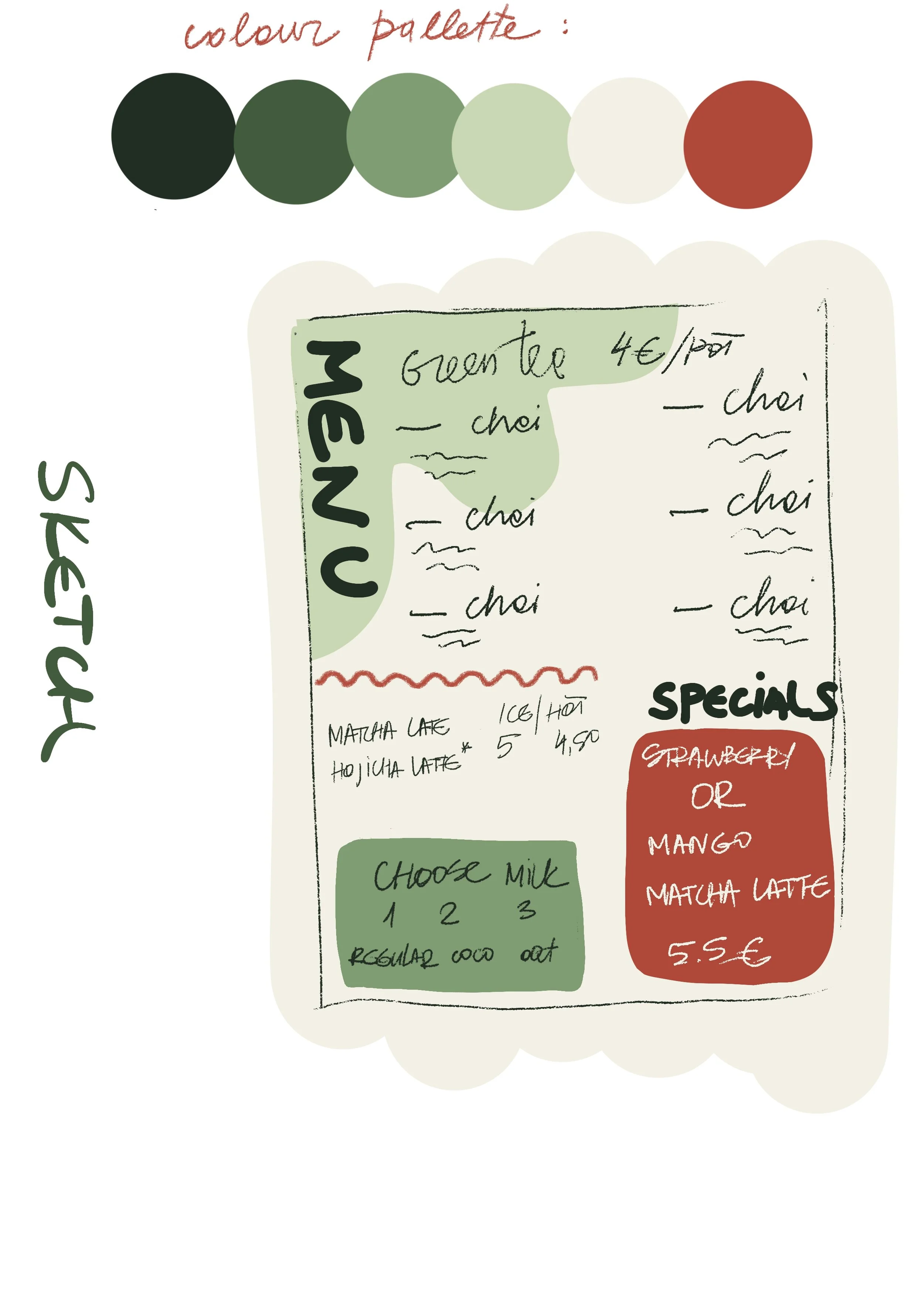
Together, these colours create a balanced and sophisticated visual language that reflects the brand’s focus on ceremonial matcha, Japanese tea traditions, and a calm café experience.
